Mortgage Websites & SEO
Best Mortgage Loan Officer Websites: What Makes a High-Converting Website in 2026?
A criteria-based breakdown of what the best loan officer websites do differently, with real template examples and a checklist you can run against your own site today.
By Mortgage Site Pros Editorial Team · Published · Updated
The best mortgage loan officer websites are not the flashiest ones. They are the sites where a borrower, a referring agent, or a past client can land on any page, understand within a few seconds who you are and where you lend, trust that you are licensed and real, and take one obvious next step. Everything else is decoration.
There is no official ranking of mortgage websites, and anyone who tells you their site is the number one loan officer website is selling something. What we can do is define the criteria that matter for a mortgage business, explain why each matters, and show what it looks like in practice. When we say best in this guide, we mean best fit against those criteria, not a popularity contest.
If you are rebuilding from scratch, pair this with our guide to choosing mortgage website templates. If your site already looks good but nobody finds it, jump to mortgage SEO for loan officers. And for how the website fits into your whole marketing plan, see the complete loan officer marketing guide.
What does high-converting mean for a mortgage website?
For a loan officer, a conversion is any action that starts a real conversation: a completed contact form, a click-to-call from a phone, a click into your application portal, a booked consultation, or a realtor reaching out about co-marketing. Page views and time on site are only useful as clues about whether those actions are happening.
That definition changes design decisions. A beautiful hero video that pushes the phone number below the fold on mobile may look premium and still lose calls. A long page of program descriptions may attract searches but never ask the reader to do anything. High-converting sites keep asking a clear, low-pressure question on every page: would you like to talk about your situation?
It also means measuring. Before you change anything, make sure you can count form submissions, calls from the site and application clicks separately. Otherwise you will be redesigning based on opinions.
The criteria we use to judge loan officer websites
We use eight criteria. None of them require a large budget, but each one requires a decision. The table summarizes what to look for and how to check it quickly.
| Criterion | What good looks like | Quick self-check |
|---|---|---|
| Clear positioning | Headline says who you help and where you are licensed | Could a stranger repeat what you do after five seconds? |
| Trust and compliance | Individual and company NMLS IDs, Equal Housing logo, licensing states, real photo | Is NMLS information visible in the footer of every page? |
| Obvious next step | One primary action, repeated; phone tappable on mobile | Can you reach contact from any page in one tap? |
| Mobile speed | Fast loading, stable layout, readable text without zooming | Test the homepage on a phone over cellular data |
| Useful content | Program explainers, first-time buyer guides, local market pages | Does each page answer a question a borrower actually asks? |
| Realtor appeal | Team or partner page, explanation of how you communicate during a deal | Would an agent feel comfortable sending a buyer here? |
| Accessibility | Contrast, labels on form fields, keyboard navigation | Can you tab through your contact form? |
| Lead routing | Form submissions reach a monitored inbox or CRM promptly | Submit a test lead and time the response |
Positioning: say who you help in the first screen
Many loan officer homepages open with a generic line about making homeownership dreams a reality. It is not wrong, it is just interchangeable. Compare that with a headline that names the audience and geography: purchase and VA loans for families in the Tampa Bay area, or a team of loan officers serving first-time buyers across North Carolina. The second version filters visitors and tells search engines and AI systems what the page is about.
Under the headline, use one sentence to describe how you work, then two buttons at most: a primary action (start an application or request a consultation) and a secondary one (call or view loan programs). If you work primarily through realtor referrals, consider a visible link for agents as well.
- Name your primary loan types, not every product you can technically originate.
- Name the states or metro areas where you are licensed and active.
- Use a real photo of you or your team; generic stock photography weakens trust.
- Keep the hero copy short enough to read on a phone without scrolling.
Three real template examples and what they do well
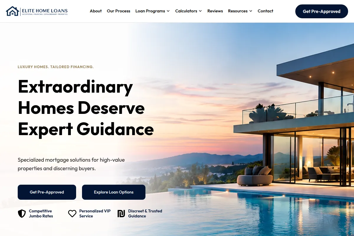
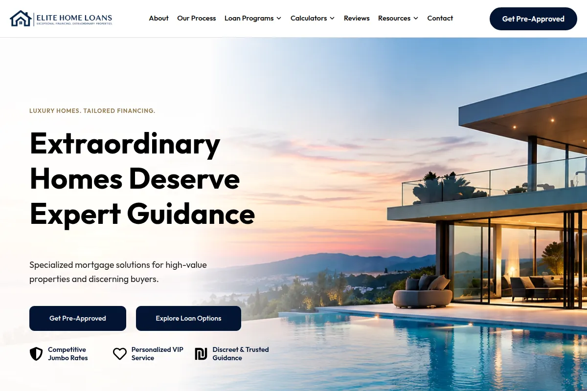
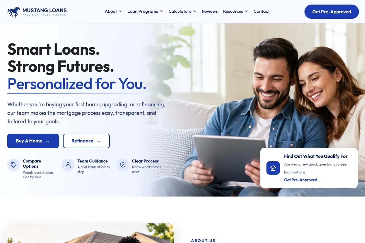
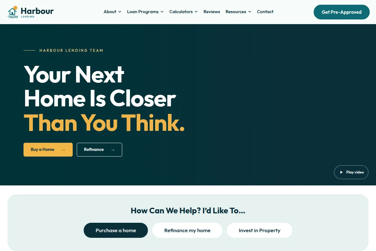
The screenshots below are real Mortgage Site Pros templates, captured from their live previews. Click any image to open the preview. We picked them because each one illustrates a different way to meet the criteria above, not because one is objectively superior.
Elite Home: built around a single loan officer
Elite Home puts the loan officer at the center. That works best when your personal reputation and referrals drive most business. The design keeps the primary action visible and gives calculators and program pages easy entry points, so a borrower who is still researching has somewhere useful to go instead of leaving.
Team Advantage: built for teams and partner trust
Teams have a different problem: the visitor needs to understand who they will actually work with. A team page with individual photos, roles and NMLS IDs answers that. It also gives realtors a page to share with their buyers, which matters if realtor referral partnerships are a big part of your pipeline.
Harbour Lending: built for content and education
If you intend to publish local guides and answer common borrower questions, a layout with a strong blog section and readable typography pays off over time. This is the style we would point to for loan officers committing to mortgage SEO.
Trust signals and compliance basics
Borrowers are about to share income, credit and asset details with you. Before that, they check whether you are legitimate. Many will look you up on NMLS Consumer Access, so make sure the name, NMLS ID and company on your website match your registry record exactly.
Display your individual NMLS ID and your company NMLS ID, your licensing states, and the Equal Housing Opportunity or Equal Housing Lender logo as your company requires. Many lenders and brokerages have specific website disclosure rules, and state regulators can have their own. This guide is not legal advice; your compliance team should approve the final footer and any rate or payment examples.
Reviews help, but only real ones. Link to your review profiles or display verified reviews you have permission to use. Never write testimonials yourself or paraphrase them into something more glowing than the client actually said.
- Footer on every page: name, NMLS IDs, company, licensing states, Equal Housing logo.
- Privacy policy and, if you collect phone numbers for texting, clear SMS consent language.
- No advertised rates or payments without the disclosures your compliance team requires.
- Office address or location information where your company allows it.
Mobile speed and usability
Many borrowers first see your site on a phone, often after tapping a link from a realtor text or a social post. Google documents the Core Web Vitals used to describe loading, interactivity and visual stability; see web.dev on Web Vitals. You do not need to obsess over scores, but you should avoid the common causes of a slow mortgage site: oversized hero images, auto-playing video, a pile of third-party widgets and chat scripts, and heavy rate tickers.
Usability on mobile is mostly about thumbs. Phone numbers should be tappable. Buttons should be large enough to hit. Forms should use the right keyboard for each field and ask only what you need for a first conversation: name, phone or email, and what they are trying to do. Leave Social Security numbers and income details for your secure application system.
Content that answers borrower and agent questions
Strong loan officer sites do more than list programs. They explain them in plain language: what an FHA loan is, who typically considers a VA loan, how pre-approval differs from pre-qualification in your process, what closing costs usually include. Each explanation should end with an invitation to talk about the reader’s situation, because general information is not a personalized quote.
Local content is where loan officers have an edge over national lenders. A page about buying in a specific county, written by someone who closes loans there, is more useful than a generic national article. Google’s guidance on helpful, people-first content is a good filter: write for the reader first, and show your firsthand experience.
What happens after someone fills out the form
A website cannot convert a lead that nobody answers. Decide where form submissions go, who receives them, and how quickly someone responds during business hours and after hours. Then test it: submit a lead from your phone on a Saturday night and see what happens.
Many loan officers connect their site to a CRM so every inquiry is logged and assigned. That is a separate decision from the website itself and should be scoped carefully; see our mortgage CRM guide and our playbook on mortgage lead follow-up.
A 15-minute audit you can run today
Open your site on your phone and work through this list. Write down every no, then fix them in order.
- Within five seconds, is it clear who you help and where?
- Is your phone number tappable on the homepage and contact page?
- Are both NMLS IDs and licensing states in the footer?
- Does the contact form work, and do you receive the test lead within minutes?
- Does every program page end with a next step?
- Is there at least one page a realtor would want to share?
- Does any page take noticeably long to show content over cellular data?
- Can you tab through the form with a keyboard and see where focus is?
- Are all reviews real and permissioned?
- Do you have a way to count form submissions and calls from the site?
Frequently asked questions
What should a mortgage loan officer website include?
At minimum: a clear headline naming who you help and where, a real photo, your individual and company NMLS IDs, licensing states, Equal Housing logo, loan program explanations, a short contact form, a tappable phone number, a link to your application system, and a privacy policy. Add calculators, a blog and a realtor page as you grow.
Is a template good enough, or do I need a custom website?
For most individual loan officers and small teams, a well-built mortgage-specific template is enough, because the structure borrowers need is fairly consistent. Custom design makes sense when you have an established brand system or unusual requirements. See how to choose a mortgage website template for a decision framework.
How do I know if my website is converting?
Count the actions that start conversations: form submissions, calls from the site, application clicks and booked appointments. Compare those counts month over month and against traffic. If traffic grows and actions do not, the problem is usually the message, the next step or the follow-up, not the visuals.
Can I advertise rates on my website?
Rate and payment advertising triggers disclosure requirements and many companies restrict it. Do not publish rates or payment examples without approval from your compliance team.
Does my website need special optimization for AI search?
The same fundamentals apply. Google states there are no additional requirements to appear in its AI features beyond normal SEO best practices. Clear headings, direct answers, accurate business information and genuinely helpful pages serve both traditional search and AI summaries.
Sources and further reading
Explore our mortgage website templates
Open the live previews, compare layouts for solo loan officers and teams, and pick a starting point that fits how you actually get business.
Explore templates